Hipgnosis Selected Album Covers Part 2: 1974-1976
I'm looking at Hipgnosis, an album cover designing team whose glory days were in the 1970s, part by part. The first part, which you might call their 'early years', is here. This is part two, covering the 'middle years'. I want to call this the 'peak period', not because it's where their greatest work was done but it's the era during which they appeared to be most in demand, or at least when they were working at their hardest. The dénouement will come next, in 'part three'. Actually there are some cool designs then, too. And Scorpions.
Warning: this particular entry is quite graphics-intensive, since in some cases I've chosen covers with particularly high resolution (blown-up once you click on them). It might take a while to load and it might take a Ctrl-R or two. Worth it, though.
Who? Well, nice of Hipgnosis to help out some unknowns. Not that they did much - the whole thing is that they've painted eyes on the duo's eyelids and photographed them with their eyes closed, to match the album's rather horrible title. Mind you, nothing - not the album title, not the creepiness of the eyes, not the painful anonymity - is as creepy as that guy in the back's hair.
The design here is pictures of Frampton smiling like a pretty boy with water being thrown at his face. While they could have just superimposed water splashes over top, they decided to actually throw wather at Peter Frampton and shoot it freeze-frame. I mean, come on... look at that picture. Wouldn't you?
Oh sweet Jesus. What was in the water in the 1970s that made hairy white men think we wanted to see them naked? This ghastly, ghastly cover appears to feature this unibrow monster masturbating with leopard-print panties on. Horrifying, horrifying, horrifying, and the black dot maintaining his dignity (snort) makes the picture no less horrifying. What the hell, from Harper himself to Hipgnosis to Harvest/EMI to record stores, was everyone thinking?
This album cover is also iconic, though I have to admit I'm not sure why. Not exactly showing the band's proper name and showing nothing else, it's a logo where a cover should be, industrial and mass-produced in appearance. Perhaps that explains its renown, but I can't really say that it merits it.
While this is not the most progressive of covers, reminding me of R. Crumb and his 'darkies', something that by the mid-seventies should already have been obsolete, it is if nothing else a well-composed cover, a huge banana-stamp on a brown background. Whoever 'Blue Mink' are.
If Cochise's boob last time out didn't earn me a warning from Blogspot, this one certainly will... if that's even a woman's breast. And I have to confess that for the life of me I don't know. "Poetry in Lotion" is a god-awful album title, but Hipgnosis have done what they can with it, fashioning a hair lotion jar for the cover. And then I guess thought it wasn't enough, so stuck in a breast of unknown gender.
A pretty cheesy cover for the Pretty Things, who get all the cheesy Hipgnosis covers. A woman (with a silk tie) isriding a torpedo out to sea, in a Dr. Strangelove rip-off. A man on a ship waves her off in what is perhaps a sexual reference, could I be bothered to think about it.
As we'll see soon enough, I don't think 'sexy' was really Hipgnosis's strong point. This cover was bowlderised in the USA and controversial in the UK, though it doesn't seem like that big a deal to me. Two future members of Throbbing Gristle, who did things much more graphic than this. Anyway, the couple making out is barely the focus here. Instead it's the bathroom, which has become as 'bathroomy' as possible, with more metallic, water-spurting phallic objects than you can shake a phallic object at.
You get a sense, in particular with Pink Floyd and Led Zeppelin, that there was increased pressure to 'outdo' themselves each time with cover art, and that eventually leads to full 'packages' that are perhaps overthought. There's a lot of detritus involved here - coloured shrinkwrap, inner sleeves, labels, etc. But let's stick with the cover: it's a cynical handshake on a studio lot between two empty suits, one of whom is on fire. Enigmatic, bizarre, curiously funny, and well-done. It's 'clean' and again doesn't have Pink Floyd's name on the cover. The 'burn mark' where the picture frame is burning in the heat of the flames, is a bit cheesy, though.
The Wikipedia page for this album shows a sadly generic album cover, and I was amazed to think it could be Hipgnosis's work - turns out it's not, in fact. This, some alternate cover I guess, is. And it looks like it: a pretty old(e) English building, a woman in fur, a man in an old car, and a woman in the middle of the picture who is unfortunately going supernova. What's it all about? Shrug.
Two balls, I'd say snooker balls if they were the same size. Neat and clean, representing the planets as opposed to the whole 'gender' thing (or mythological gods). It's a pretty, clean image for some reason complicated by an overly-fussy text. This is Paul McCartney, by the way.
Hipgnosis, obviously, was not responsible for the infantile spoonerism of the album title and have helpfully decided to ignore it. This is a man trying on a semi-invisible suit, a cute idea that turns out rather uncute in the execution. I'm not sure why exactly; it's the remainder of the photograph, I think. Maybe it could have been a bit more cartoony? I don't know. It doesn't draw the eye, though, even though it's a clever cover.
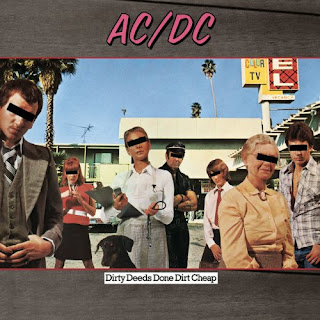
I should point out that this is just the 'international' cover, for in sweet home Australia, they got a cheesy drawing baced around a tattoo on a bicep. But this one I quite like, a random assortment of people in front of a stone-age motel, so far so boring - but each person (why not the dog?) has their eyes covered with that anonymity-retaining black bar. Thus implying guilt where it might not actually exist. Nice. Plus, this was the first record I ever owned, so there's sentimental value. But 'Big Balls' is truly a god-awful song, isn't it?
A 'dark' cover in both senses of the word, this is a picture of an old man tied with chains and placed with his head on a railroad track, as a train approaches. The design is conventional, the image a bit more bleak than either Hipgnosis or Golden Earring typically are.
This, ladies and gentlemen, is a giant crotch. Like seriously - a would-be gynecologist could use this for practice. The album title in this context is tacky as hell, but it's an artistically arranged and aesthetically pleasing picture of a crotch. You know, as pictures of crotches go.
Seemingly a simple enough cover, Mr Coyne in front of the Colosseum or some other building, but there's a bit of depth to it - there's someone diving from the roof, tiny and not at first visible. Oh, and it's two-tone teal-and-orange, which is apparently all the rage in Hollywood these days (Google it).
I'm not fully sure I get this. I think it's like the marquee of a movie theatre, where letters are put up individually to spell something and it's illuminated from behind. Don't know for sure, don't care to find out: it's just not an attractive cover.
This is a pretty well-known cover design as well, and there's not really any hidden meanings or subtle metaphors here. The album is called 'Year of the Cat', and Hipgnosis just takes the cat theme and runs with it. A woman is sat at her makeup table and is transforming herself into a cat. Everything on the table is in some way cat-related - magazine, perfume, cigarettes...
This is Ozzy-era Black Sabbath, trying to stay relevant in an era that had passed it by. This is supposed to be two robots having sex. Er, yeah sure, whatever. But it's slighly comic-booky and intriguing.
Not sure what's going on here - a suit at a desk calls his alcoholic wife at home to complain about her god-awful taste in furniture? Or she to him to complain about that hair gel? Don't know, and can't really be bothered to figure it out. I guess it's attention-grabbing, but it's not attractive.
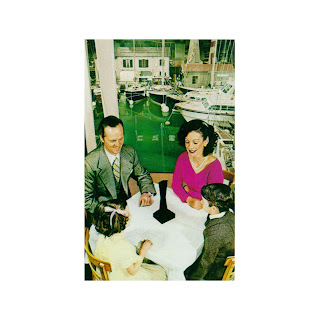
After an endless stream of increasingly sophisticated Led Zeppelin covers, this one seems (like the overlooked album itself) a run-of-the-mill step backwards. The point, though, (carried out across the front and back covers and the inner sleeve) is a black 'obelisk' object incongruously inserted into otherwise banal scenes. This is about as banal as it gets, a Vaseline-smile family at some holiday destination crowded around the black object. Kind of funny, actually. The obelisk is apparently meant to represence Led Zeppelin's 'presence', which is rubbish. But otherwise, cool.
This is Phil Collins's jazz-lite side project, so even though I've yet to hear a single note of it, I'm quite confident that it's horrid. The cover is pretty cool, though, an old guy peeking through Venetian blinds. It's something Hipgnosis does well - a real photograph that also has value as an abstract.
Ever heard of the black-eyed kids? Creepy little kids who come to people in their cars and ask to come in, kids whose eyes are completely black, without a hint of white? I think this cover is supposed to depict a rock band in a limo being mobbed by fans. But since this is Nazareth we're talking about, the black-eyed kids theory is more believable.
Based on what we've seen from UFO, you'd figure an album with this title would feature all kinds of lewd behaviour, eh? Instead... a monkey. Hooked up to a woman via red and blue tubes. Odd, but meaningless. Must have caught people's attention, though.
This is a gatefold. The back side has either a third shirtless guy or (more likely) the same guy from a third angle. And we can see that what he's doing is whittling a stick, sharpening it to a point. No idea why, or what that's to do with the band or their album, but it's nice enough, I guess. And black and white too.


评论
发表评论